Brand kit
Ink, stone and bronze. Nothing shouted.
The Fluxwise identity has to sit underneath three products with their own personalities without competing with any of them. It is quiet on purpose: stone paper, ink, one bronze, and type doing most of the work.
This page is generated from src/data/brand.ts and the tokens in src/tailwind.css. Change those and this page follows.
Logo
The mark
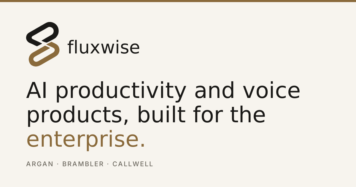
Two interlocking links, offset on the diagonal. It is the original Fluxwise icon, kept — redrawn from the raster artwork as clean vector geometry so it scales and recolours, and given the new palette: ink above, bronze below.
Do
- Use the ink-and-bronze mark on Paper; on Ink, the upper link goes Paper and the lower goes Bronze Light.
- Use the mark alone in favicons, avatars and tight spaces — it is portrait, so size it by height.
- Keep the two links in different tones. The contrast between them is what makes them read as interlocking.
Don’t
- Don’t rotate, stretch or straighten the mark — the diagonal and the angled ends are the design.
- Don’t colour a link with a product accent; Olive, Oxblood and Clay belong to the products, not the house.
- Don’t place the lockup on a busy photograph or add shadows and glows.
- Don’t set the wordmark in anything other than Instrument Serif, lowercase.
Clear space. Keep clear space around the lockup equal to the width of one link on all sides.
Minimum size. Mark: 18px tall minimum — below that the two links start to close up. Full lockup: 120px wide minimum.
Files: logo.svg, logo-reversed.svg, mark.svg, mark-reversed.svg, mark-mono.svg, favicon.svg, og-image.svg






Colour
Stone, ink, and one bronze.
Paper
The site is light by default. Paper carries almost everything; the deeper tones separate sections without borders.
Page background
bg-paperAlternating sections, quiet panels
bg-paper-warmPull quotes, inset blocks
bg-paper-deepInk
One near-black, two greys, two hairlines. Body copy never goes lighter than Ink Muted.
Headings, primary buttons, the upper link, the wordmark
text-inkBody copy, ledes
text-ink-mutedMeta labels, captions
text-ink-softHairline rules and card borders
border-lineInputs, hover borders
border-line-strongBronze
The one accent. It appears as the lower link in the mark, a single word in a headline, or a link — one job per view. Two weights: plain Bronze for graphics, Bronze Ink wherever it becomes text, because Bronze alone is 4.3:1 on Paper and body copy needs 4.5:1.
The lower link in the mark, rules, display words
text-bronzeLinks, focus rings — the text-safe weight
text-bronze-inkHover and active states
text-bronze-deepThe lower link on ink grounds only
text-bronze-lightHighlight backgrounds, quiet badges
bg-bronze-tintProduct accents
Each product owns one accent so it stays recognisable inside the Fluxwise system. Products keep their own names; Fluxwise keeps the layout.
Argan
text-oliveBrambler
text-oxbloodCallwell
text-clayTypography
A serif that carries the headline, a grotesk that gets out of the way.
Display
Instrument Serif
Page headlines and section headings, 32px and up. Regular weight only — the size does the work.
"Instrument Serif", Iowan Old Style, Georgia, serifBody
Inter
Everything else. Regular for prose, Medium for buttons and labels. Never bold a headline.
"Inter", system-ui, sans-serifMeta
Inter · uppercase
12px, 0.14em tracking. Eyebrows, table headers, product categories.
"Inter", system-ui, sans-serifVoice
Say the thing, then stop.
Plain British English. Specific nouns. No adjective doing a verb’s job. If a sentence would survive being said out loud in a meeting, it can stay.
Plain, British, specific
- Do
- Argan records the session and writes the bug report.
- Don’t
- Argan leverages cutting-edge multimodal AI to revolutionise QA.
Claim only what is shipped
- Do
- In private beta on macOS.
- Don’t
- Trusted by thousands of enterprise teams worldwide.
Lead with the work, not the model
- Do
- Turns a rambling stand-up into three tickets in Linear.
- Don’t
- Powered by a state-of-the-art LLM pipeline.
Respect the reader’s judgement
- Do
- Every action is confirmed before it leaves the room.
- Don’t
- Fully autonomous — no human needed.
Components
The parts everything is built from.
Buttons
Primary buttons are Ink — they turn Bronze on hover. One primary action per view. Corners are 4px; nothing is a pill except tags.
Fields
White fill on paper, Line Strong border, Bronze Ink focus ring. Labels sit above the field and never inside it.
Product accents
- Argan — Olive
- Brambler — Oxblood
- Callwell — Clay
An accent identifies a product in lists and on its own page. It never becomes the page background or replaces Bronze in navigation.
Layout
- Content column: 72rem max, 1.5rem gutter (
.fw-container) - Sections separated by hairlines or a Paper Warm band — rarely both
- Ink bands for emphasis, no more than twice per page
- Reveal on scroll: 12px rise, 500ms, disabled under reduced motion
Fluxwise · The enterprise provider of AI productivity and voice products. Written guidance lives in docs/brand-kit.md.